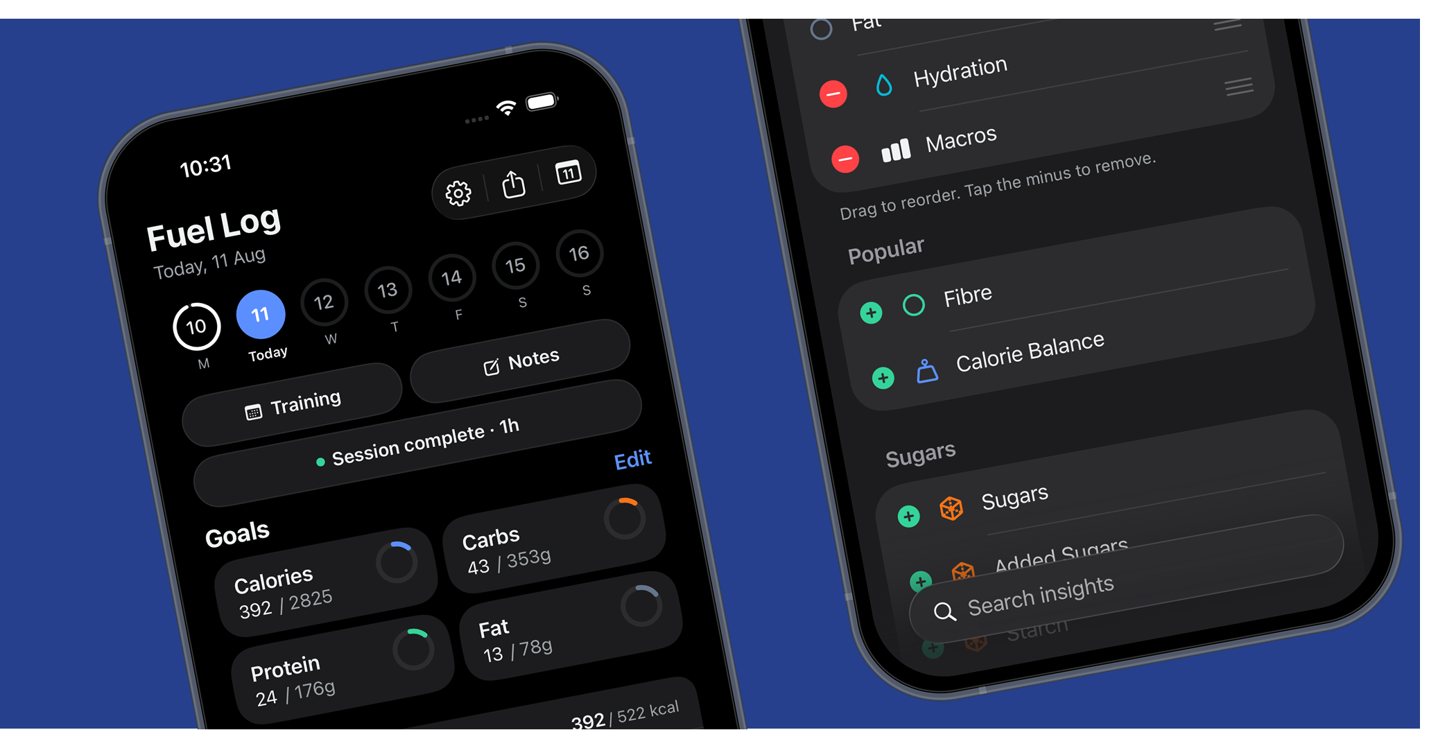
M0VE Nutrition has been rebuilt for iOS 26. Not reskinned. The parts of the app that were drawing their own version of what iOS already does have been taken out and replaced with the real thing.
For context we're always looking to improve the app and when we first set out on doing this we wanted to make something unique but then we realised we needed to talk to our users so we did and what came of this wasthe functionality for users and experience with what they already have in IOS mattered more. So from the ground up we've redesigned the inside of the app to be native.
What that means in practice:
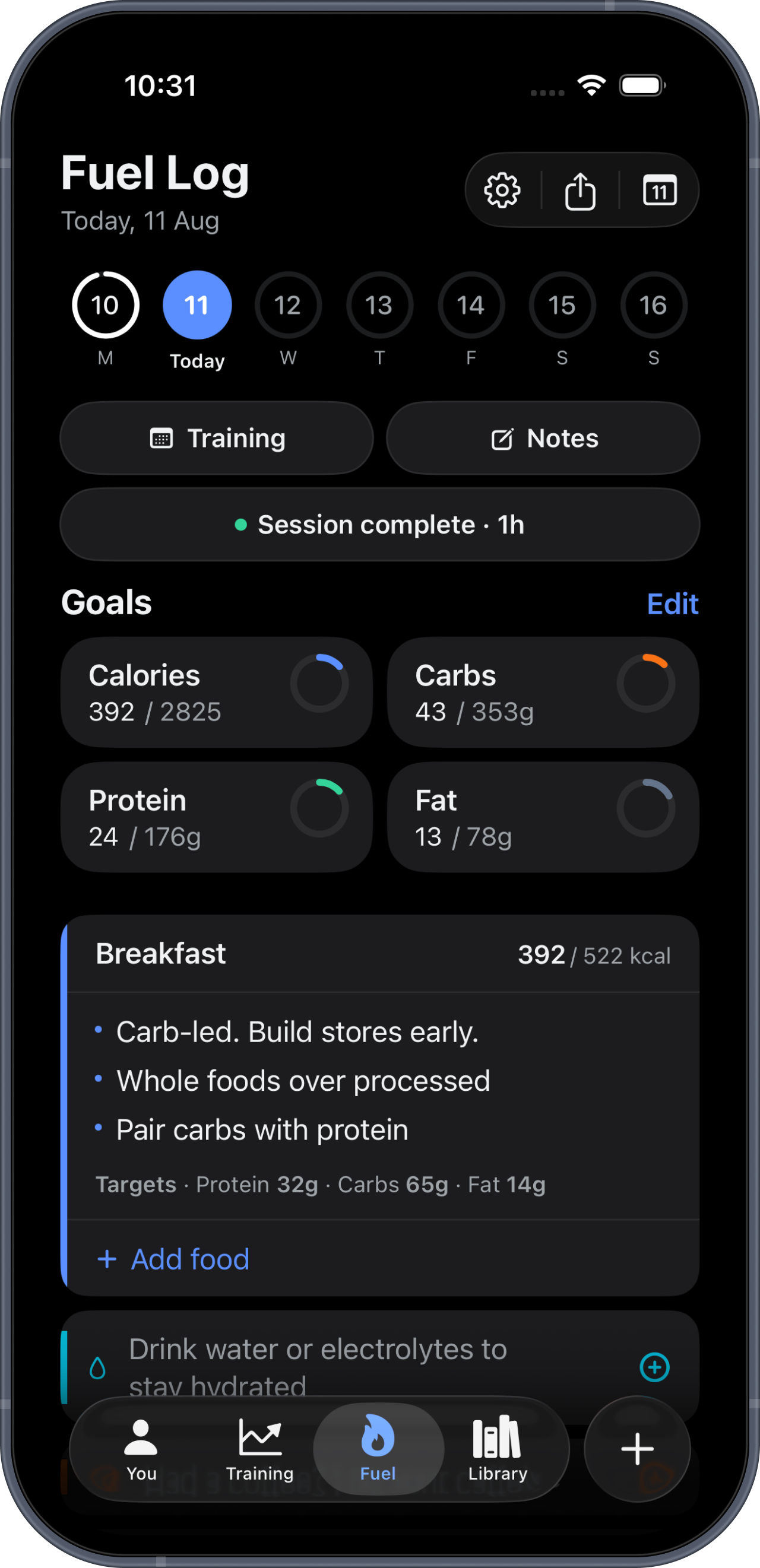
Native navigation and tab bar, so the interface shrinks, floats and behaves the way every other app on your phone does
System menus and confirmation dialogs everywhere a choice is made
Grouped forms in place of hand-drawn cards, on every screen where you enter something
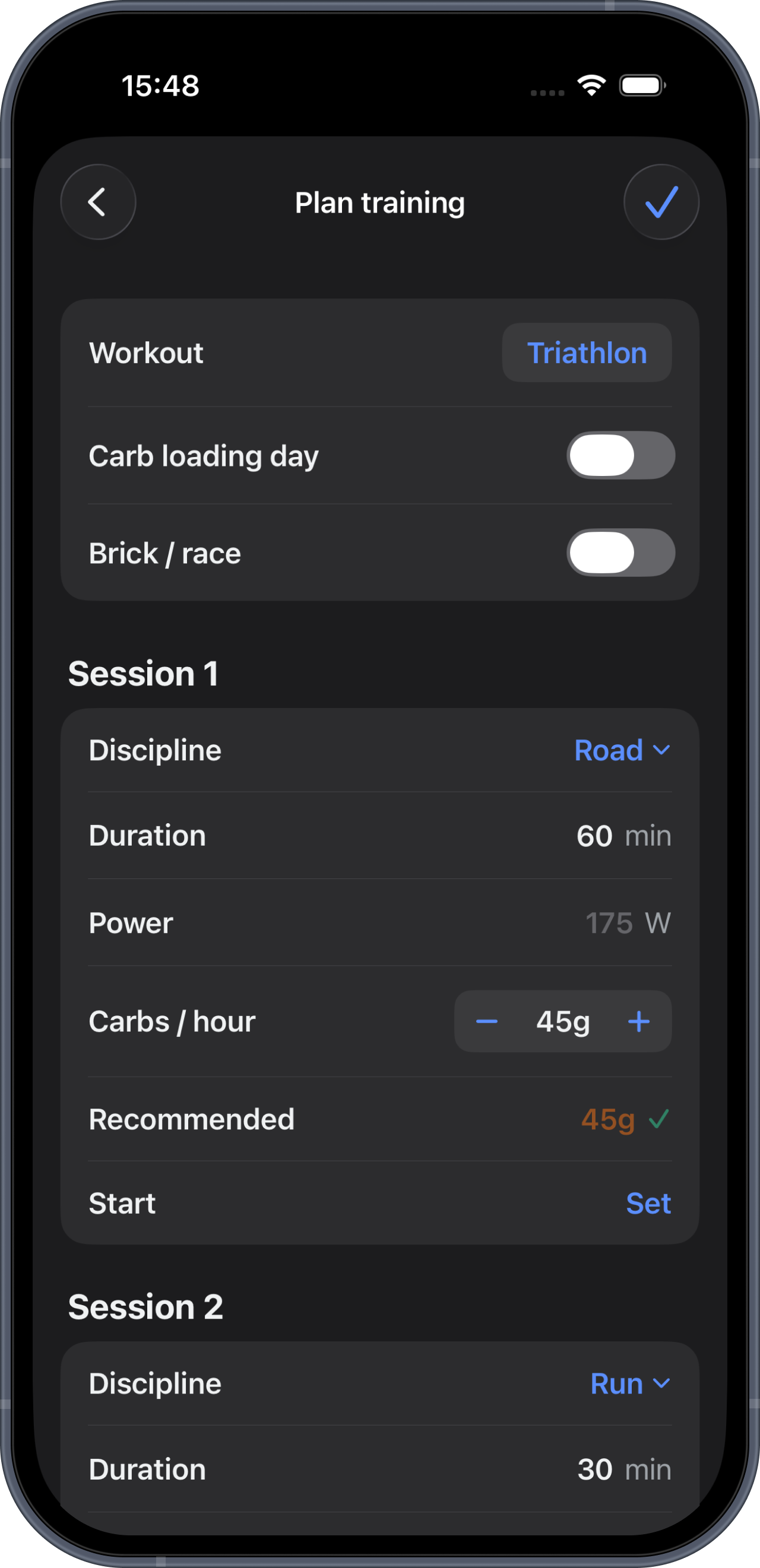
Per-session carb targets, so a brick or a multi-session day is fuelled leg by leg rather than averaged
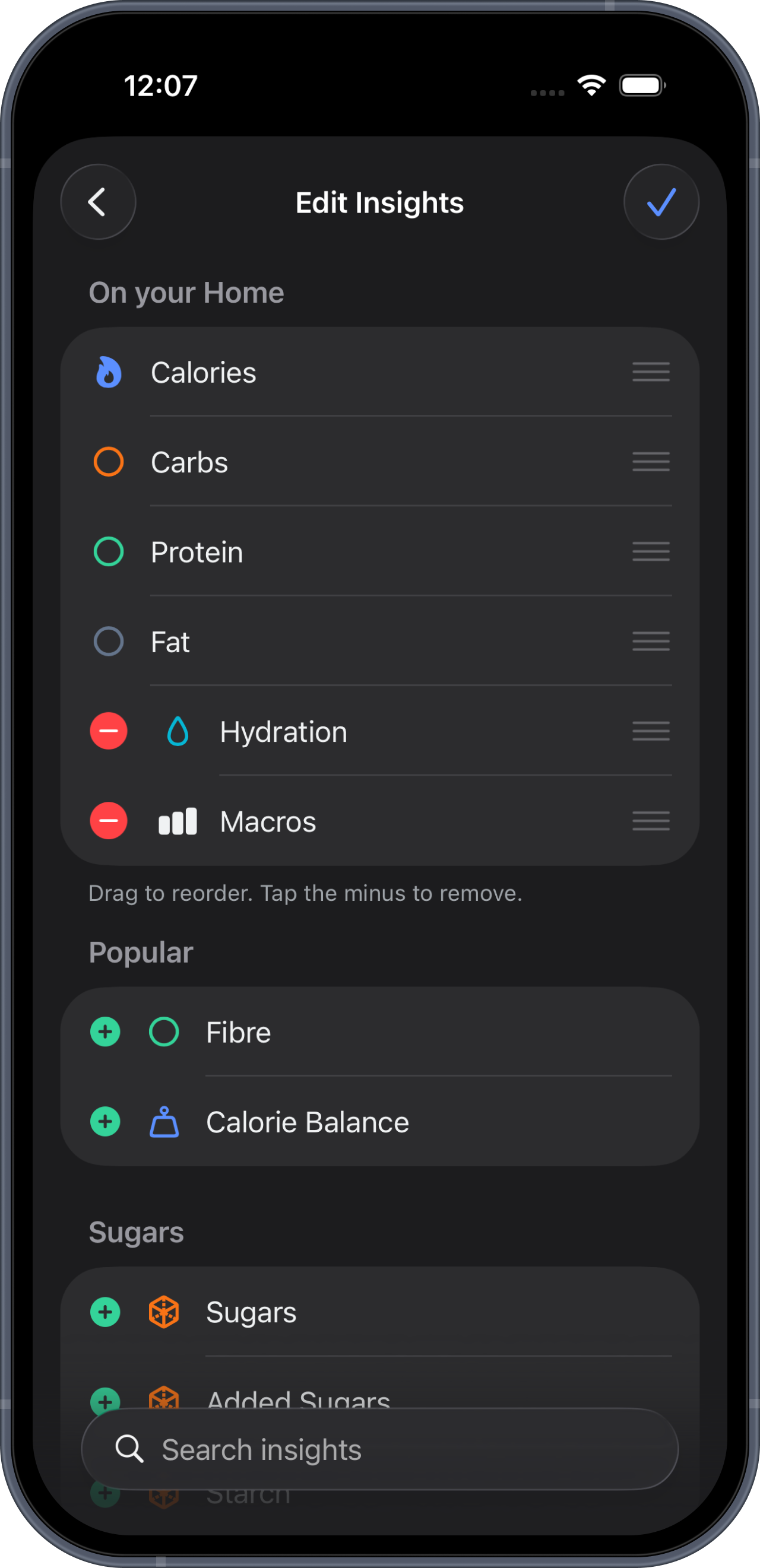
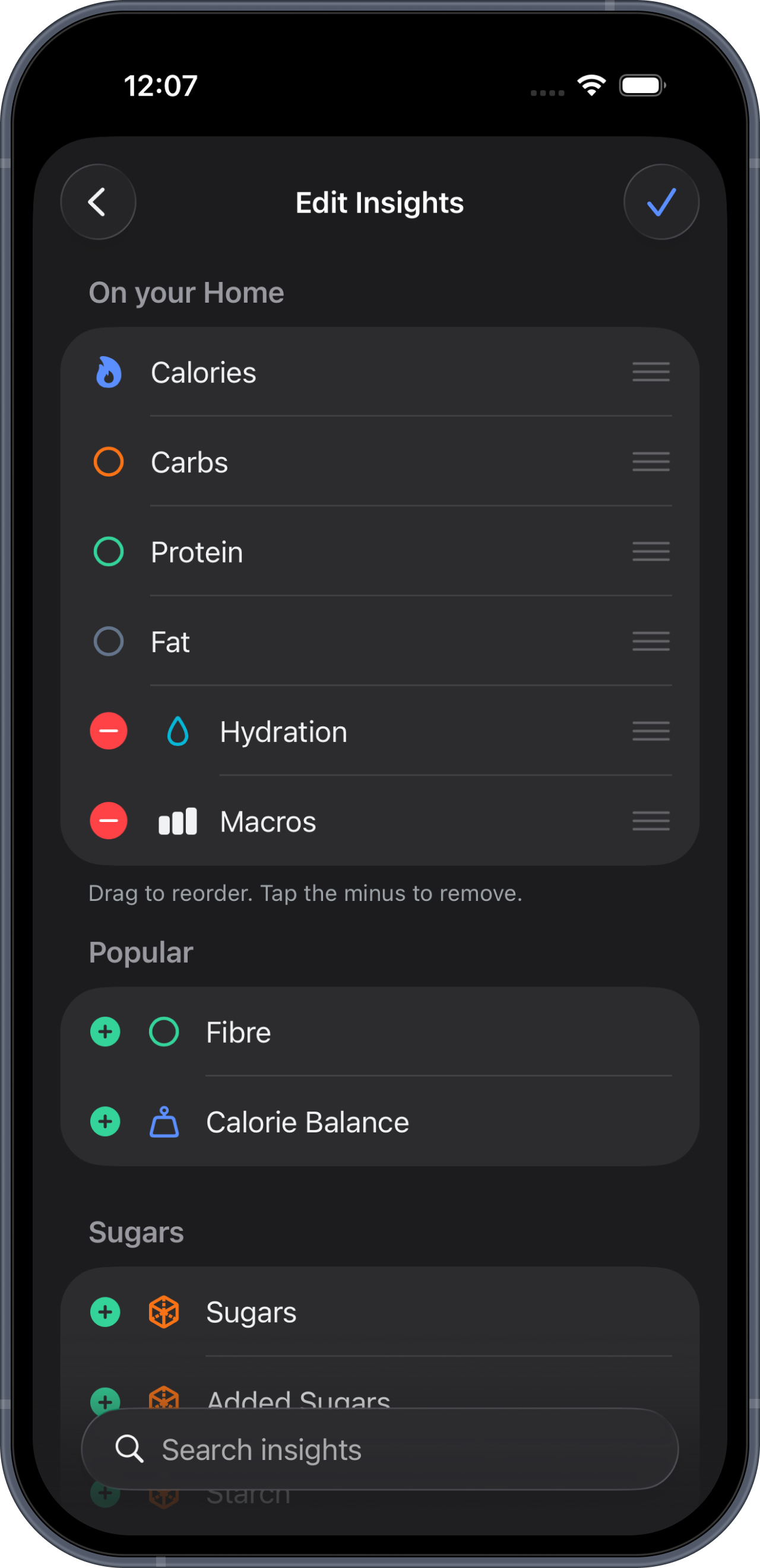
A home screen you choose, with the four that matter fixed in place
A session page that reads like a page rather than a dashboard
Typography aligned to Apple's own scale, top to bottom
Why we did it this way
I could have spent this cycle adding features. I spent it deleting our own code instead.
An app that draws its own controls always ends up slightly wrong. The spacing is nearly right, the animation is nearly right, and the whole thing feels like software rather than like your phone. Worse, it breaks in ways nobody planned for. We had a confirmation sheet that measured its own height and got it wrong, so the Delete button ended up underneath the tab bar. We had a picker that expanded inside a card and pushed the fields you were typing in halfway down the screen.
None of that is a design opinion. It is what happens when you rebuild something the platform already gives you.
So when we spoke to our users it was the moment to stop. Apple's navigation, Apple's menus, Apple's dialogs, Apple's list geometry. The app got smaller and it got better at the same time, which is usually a sign you were carrying something you did not need.
The part that is actually about fuelling
The interface work paid for a change we could not have made cleanly before.
A triathlon brick is not one workout. It is a swim you cannot eat during, a bike leg that will take 70 to 90 grams of carbohydrate an hour, and a run leg where your gut will not tolerate the same. Until now M0VE gave that whole day one carb number, and you could not set it until after the session was saved.
Now every leg carries its own target, set while you plan it, with the app's recommendation next to your number so you can always see what you moved away from. The swim does not get the field at all, because there is nothing to set.
The same applies to a day with three separate sessions. Each one is fuelled on its own terms, and each session's fuel card now says which workout it belongs to instead of being called "Session fuel 2".
A home screen you actually chose
The insights on your home screen are yours to pick. Hydration, fibre, sodium, iron, the vitamins, whatever you are watching this block. Add them, remove them, drag them into the order you want.
Calories, carbs, protein and fat stay put. If you are tracking nutrition at all you are tracking those four, so they are always there. You can still reorder them, you just cannot lose them.
App details
Version 1.3.0 Price Based on subscription Requires iOS 26 or later Available Apple App Store, movenutrition.app
Android is in development.
What is next
We are working on structured workouts from TrainingPeaks, when their API opens to new partners again. We have applied.
Beyond that, the same direction as this release. Every screen an athlete uses while they are actually training should be readable at a glance, on a phone, in the wind, with cold hands. That is the bar.